Charts
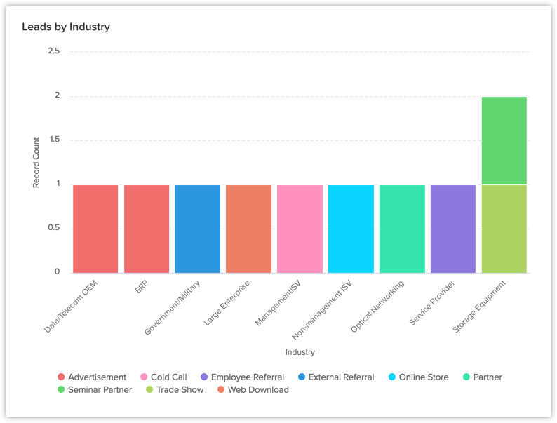
A chart presents data from various records of a module(s) in a visual or graphical representation for an easy analysis. The data is seemingly comprehensible as users can easily pick out the patterns, trends, etc., which may otherwise be difficult to interpret. For example, you are the Sales Manager for Asia Pacific region and want to compare the number of leads created by the sales representatives in the previous year. You can easily achieve this by creating charts in your dashboard and compare the number of leads created by different sales reps.
In Zoho CRM charts, you can:
- Create different types of charts depending on your business requirement.
- Present information in a graphical pattern that is more comprehensible.
- Customize, reorder, and organize the charts in the dashboards.
Based on your business requirement you can select from the below mentioned list of charts:
| Chart Type | Description |
| Bar chart & Horizontal chart | To display two or more kinds of data, that can be used to compare values across categories. |
| Line Chart | To display a trend over a period with the variations in the multiple values in a single chart. |
| Pie Chart & Donut Chart | To display data that is divided into triangular areas proportional to the percentages of the whole and used to illustrate the relationship of parts to the whole. |
| Table Chart | To show sum of the values in each category of the data. |
| Funnel Chart | To display different stages in a process and the associated data across categories |
| Area Chart | To visually represent one or more quantities that change over time. |
Create Chart Using Reports
You can create charts from the existing reports in your CRM account. The data from the selected report will be represented graphically.
To create chart from reports
- Click the Dashboards tab.
- In the Dashboards page, select the dashboard in which the chart has to be added.
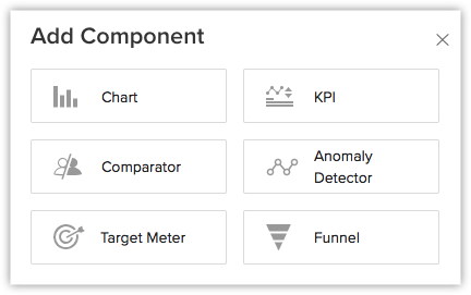
- Click Add Component.
- In the Add Component page, click the Chart.
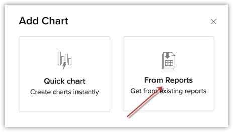
- In the Add Chart page, choose From Reports.
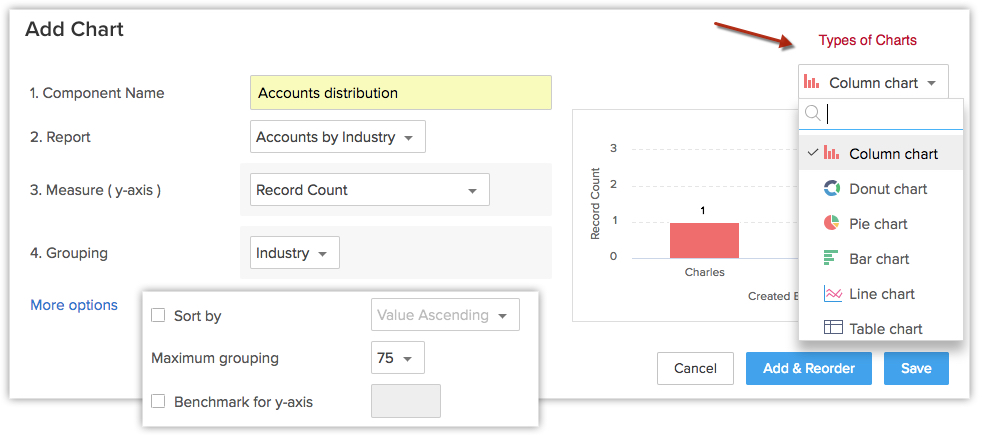
- In the Add Chart page, do the following:
- Enter the component name.
- Select a report from Report drop-down list.
- Select an option, in the Measure (Y-axis) and Grouping,from the list of available components.
- Click More Options to choose Sort by, Maximum grouping and Benchmark for y-axis.
- In the top right, you can select the desired chart type using the drop-down list.
- Click Save, to add the component to Dashboard.
- Click theAdd & Reorder to add and rearrange the components.
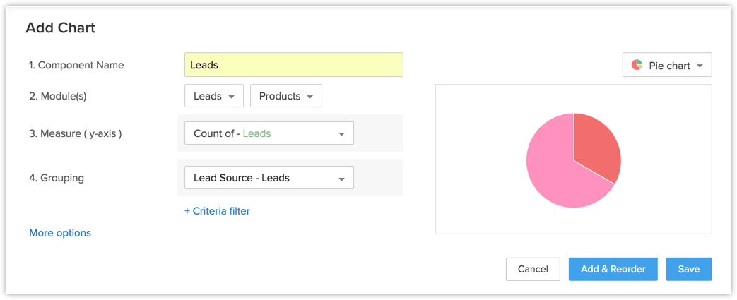
Create Chart Using Quick Chart
In quick charts you can create charts by defining your own metrics, based on which the data will be represented in a graphical manner.
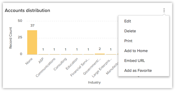
You can also view the total number of records by clicking on any single bar in the chart.
To create chart from quick chart
- In the Add Chart page, click Quick Chart.
- In the next page that appears, do the following:
- Enter the component name.
- Select the Module and the related module for the chart from the drop down list.
- Select an option, in the Measure (Y-axis) and Grouping,from the list of available components.
- Click Criteria Filter, to remove specific records that meet the mentioned criteria.
- Click the More Options to select Criteria Filter, Sort by, Maximum grouping and Benchmark for y-axis.
- Select the Chart type from the drop-down list.
- Click Save.
- Click Add & Reorder to save the chart in a dashboard and to rearrange it instantly.

You can Clone, Edit, Delete, Print, Add to Home, Embed URL or Add a chart to favourite by clicking on the More icon in a component.
Related Articles
Gantt charts
The Reports module in Zoho Projects shows a variety of data in terms of Gantt charts and reports for tasks, bugs, and timesheet to help you measure productivity and work progress effectively. Feature Availability: Editable Global Gantt ...Add charts to slides
Include Zoho Show's Charts in your presentations to help your audience grasp the concepts better. The Platform allows you to add charts such as Column, Bar, Line, Scatter, Pie, Area and other miscellaneous varieties. You can alter the values ...Add and Edit Different Types of Charts
Charts contain graphical representations of numbers and accounting data to represent a study or analysis that you have done. For example, you might want to track the growing trends in your business, the change in ratings for a television show, or the ...Animate Charts by Series, Categories or as Single Object
Charts lets you visualize huge data reports, highlight an increase in a trend, and compare two different variables in the best possible way. And, animating them is another way to discuss, compare and explain each element/datum one by one in a more ...In the Home tab, how can I add charts that represent the CRM data?
You can represent CRM data in the Home tab by adding pie charts, bar charts and many more. You can create these charts in your Dashboard using the steps below: Click Home tab. In the Home page, click the Add Component link. In the Add ...